

Google first increased the impact of a website’s mobile-friendliness on its ranking position back in 2015.
As part of this update, every website that showed mobile-responsive qualities received a small ranking boost in the mobile search results only.
Fast forward to 2018, and another update brought about what has now become known as ‘mobile-first indexing’, and this switched up how Google crawls, indexes, and ranks web pages.
Before mobile-first indexing, a person searching on their iPhone, for example, would see mobile results on Google, whereas someone using a desktop computer would see desktop-specific results.
Now though, no matter what device a person is using, they will always see results from Google’s mobile index.
So, what’s the reason for this change?
Well, it comes down to the surge in popularity of mobile browsing. It’s now more likely that someone visiting your site will be using a mobile device instead of a desktop computer.
Because of mobile-first indexing, it won’t do your rankings, or your traffic, any favours if it turns out that your website performs worse than your competitors’ sites on a mobile browser.
To protect against this, your SEO agency, or whoever is completing SEO on your behalf, needs to include specific steps to make sure all of your content is formatted correctly, and that it’s as easy as possible to read and interact with regardless of a visitor’s specific screen size.
Here are a few tips to help you out…
Take Google’s mobile-friendly test
Who wants to go to the hassle of checking all of their site’s pages on multiple different devices?
We don’t.
That’s why we use Google’s mobile-friendly test, a simple online tool that lets us check whether our clients’ sites are mobile-friendly.
We recommend running this test for each new web page or piece of content that you create.
Depending on the results, you’ll either get a green confirmation of mobile-friendliness…
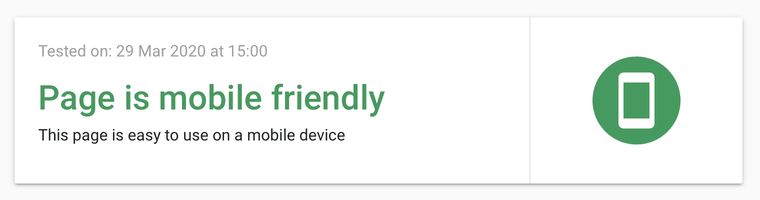
…or you’ll get a list of red errors resulting from things like text that is too small to read, or links that are too close together when viewed on smaller screens.
Run this for your site, and fix any red warnings as a priority to make sure your website receives the ranking boost in mobile search.
Design for mobile first
Up until recently, virtually all web development has followed a desktop-first approach.
Nowadays, though, with mobile browsing being more popular than ever, it’s crucial to design your site for mobiles first.
It makes sense.
Devices with smaller screens face far bigger restrictions.
So, if something works on a mobile, for example, a graph, table, or opt-in form, it’s nearly guaranteed to work on a desktop too.
Sadly, the opposite cannot be said.
The best approach is to find what works on a mobile, before expanding this to function on tablets and desktops too.
Use a responsive design
Your site’s design needs to be fully responsive, automatically adjusting to fit different device sizes, for example, desktops, laptops, tablets, and mobile phones.
Instead of having a different site for different sized screens, responsive designs reduce the number of manual operations required by the user like panning, scrolling, or zooming.
For example, whereas the desktop version of a site may use three columns side-by-side, this wouldn’t necessarily work on a phone. The reader would need to zoom in and pan across to read all of the text.
A site with a responsive design could overcome this issue by using CSS conditions to alter the layout.
On a mobile phone, for example, the three columns could be stacked one on top of the other instead.
While this would require scrolling by the reader, no zooming would be needed, making it much more convenient to read.
The responsive design could also use CSS to adjust button sizes, for example, making them easier to press on a small screen.
Other options include scaling images correctly, making graphs scalable and tables scrollable, and adding plenty of white space to declutter smaller screens.
Use plugins that are mobile responsive (if using WordPress)
Any plugins which affect user experience, for example through adding widgets such as email opt-in forms, galleries or call-to-action buttons to your website, should always scale and function correctly regardless of screen size.
In many cases, these plugins provide functionality which allows you to switch off certain features depending on screen size, but it’s worth checking the reviews and specification of any plugin before you install it to ensure it won’t impact your site’s mobile-friendliness.
Block popups
As of early 2017, Google started penalising websites that use what is known as ‘intrusive interstitials’ on mobile devices.
These are effectively annoying pop-ups, for example, lightboxes, or even banner ads.
They negatively impact a user’s experience of a site by covering completely or partially whatever content they’re trying to view, for example:

The websites that use these no longer receive Google’s mobile-friendliness seal of approval. Because of this, they give up the small ranking boost they would otherwise have received in the search results.
To avoid being penalised, it’s important to set various display conditions for your site.
For example, opt-in forms like the ones used to capture email addresses should be set to appear for desktop users only and not mobile visitors.
These conditions would mainly apply to lightbox and slide-in opt-in forms.
It’s usually pretty easy to update these settings for your site, especially if you’re using a plugin with a dedicated settings page.
Make it load quickly
Site speed is hugely important when it comes to SEO, so you need to make sure your site loads lightning quick otherwise visitors will get bored and look elsewhere.
This is especially critical on mobile devices with potentially slower internet connections, but don’t just take our word for it.
Here’s what happens from a seemingly insignificant one-second increase in a web page’s load time:
- Pageviews decrease by 11%
- Customer satisfaction goes down by 16%
- Conversion rate decreases by 7%
The reason?
CrazyEgg, the company that completed the study above, found that 47% of people expect a web page to load in two seconds or less.
You need to give your visitors what they want and fast.
If you can’t, they’ll vote with their mice – usually back to the search results and straight onto your competitor’s lightning-fast site instead.
Now, while a two-second load time may be somewhat unrealistic (Machmetrics found that the average site loads in 8.66 seconds), you need to do everything in your power to stop haemorrhaging traffic to your competitors due to slow load times.
Some of the easiest ways to do this are by reducing image sizes, minifying your HTML/Javascript files, or using a CDN to drastically reduce your load times.
Conclusion
We hope you found this article both interesting and useful.
The key takeaway here is that you can’t expect to outrank your competitors if your website is not up to scratch when it comes to mobile responsiveness.
There’s no point reinventing the wheel here, so feel free to steal the strategy we use for our SEO services to massively improve your site’s standing with both visitors and Google.
Good luck!


