I haven’t done a huge amount of print design in my career. I’ve done enough to know that it’s much more technical than it looks and there’s a long history of it that someone coming into it fresh won’t know until they’ve completed many years of experience, ideally within a larger design team where they can benefit from the experience of others.
My first taste of print design was when I worked for Brother Industries (UK) in Wrexham and had the task of designing a thin sticker that was going to be applied to all the AX range of typewriters (you can just about make one out on this photo). I had no experience using an Apple Mac or any print design experience but I got on with it and learned as I went.
That was my first taste of print design so I had to quickly get to grips with concepts like bleed, pantone colours, and a variety of restrictions such as the cost of printing more than one or two colours. Bear in mind that this was also the time when the web had just become a thing so I was also toying with very basic web design too!
Since then, I’ve tried my hand at a variety of print projects but mainly simple flyers and the odd business card. Just enough to know that I don’t have the experience to do a great job but enough knowledge to knock out a passable result for a client short of a budget and just enough to know that there’s a big difference between designing for print and designing for web – it requires a different mind-set!
What are the differences? These are just from my experience and i’m sure there’s more that I could have added but from what I’ve learned over the last *cough* years these seem to be the most relevant differences and not meant to be a criticism of either side of the fence.
1. Websites aren’t limited by page dimensions
When you’re designing for web the first thing you have to get your head around is the medium that the website is going to be viewed on. These days there is a massive variation in screen sizes especially when you include mobile devices like tablets and phones. We’re also moving more into smart T.Vs so it won’t be long before web design has to include much larger devices like 42inch T.Vs (it probably should now).
Print design is generally limited to page sizes like A4, A5 etc so a print designer transitioning between print and web needs to be able to remove the shackles of a limited page size. Computer screens don’t conform as easily to width and height as page sizes do.
If you position an element on a website page design you have to consider how that element could move depending on the screen it’s being viewed on. Text on the left and an image to the right might look perfect on the static page but should that expand on larger screens and the text will no longer look the same next to the image. And what about mobile? Should the image drop below the text, above the text or disappear all together?
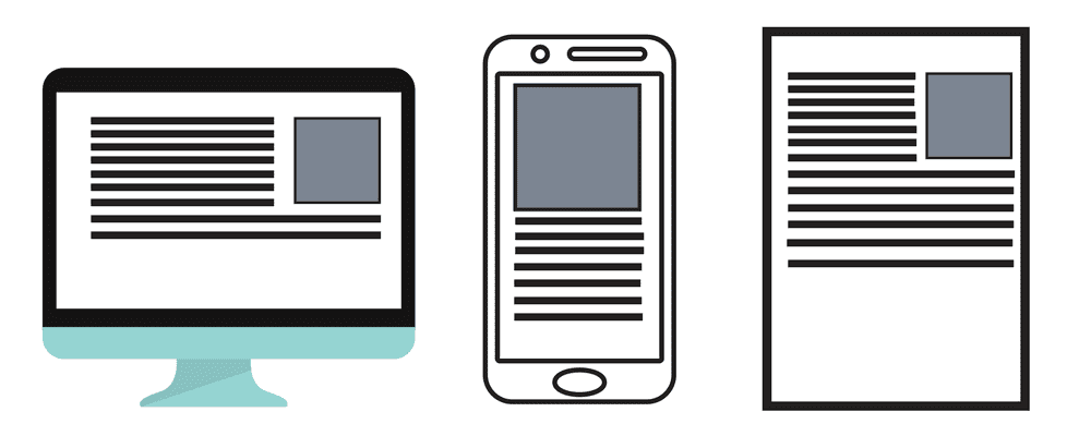
To make life a bit easier, web designers tend to think in three layouts – desktop computer, tablet device (generally portrait rather than landscape) and mobile device. Within each of these layouts there’s a variety of screen sizes that have to be checked. We have tools available to check how the page we’re working on works on each layout and at various sizes so we can quickly spot any issues with how the page looks. Then, when we spot issues, we can use code to effect the design for that device – for example, changing font sizes to avoid headlines running over two lines or we can position an image in a different place depending on the screen.
And that brings me to my next point.
2. Clients sign off print but you can’t always get sign off for web
In a traditional print agency environment, the designer will create the design, print it out on A4 and present it to the client to sign off the design.
Unless you’re prepared to create layouts for every page of the website, on every device and at every screen size and find a client who would be prepared to check every one then you can’t follow the same process for web.
I suspect that this is probably a frustration for many web developers when working with graphic designers.
Personally, I don’t present a web design to a client before starting the build. I prefer to start the build without a design to work from as that means I can experience the issues with my design ideas on each device and screen size before presenting the final design ideas to the client so avoiding getting sign off on something that later turns out to be difficult to achieve.
3. Clever text wraps around images
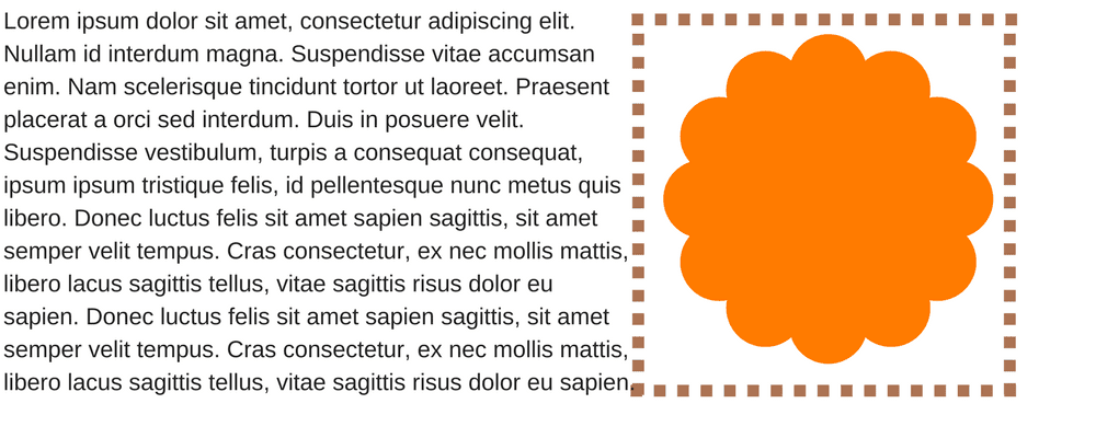
Print designers will be used to doing things like applying smart text wraps around round and curved images. They look great on print but unfortunately websites don’t really like curves and it’s impossible to wrap text in this way around an image.
I was once asked by a client to not design any straight lines into their website! That was a tough assignment.
For example, something like this looks great on paper…

…but would be impossible to achieve on a website without it being an actual image (as it is here) – so you couldn’t have the text as actual text – it would have to be an image, it wouldn’t be easily scale-able across devices and Google won’t recognise the text so would have negative SEO (see my later point on this issue).
Web designers have to think in straight lines. Curved images are in fact square images so the wrap ends up being square against the actual image file rather than the curved element within the image.
3. Websites can do really clever things
With print design you’re limited to physical restrictions from the use of the paper or board that you’re printing on. Yes, you can create very clever packaging and die cuts and I’ve seen some amazing, clever use of these techniques over the years but website technology and code has come a long way over the years and now do some really clever things.
Animation is commonplace on websites now. Video and sound can be easily embedded to create an interactive experience for users. Hover effects on buttons, images and text is used to highlight and guide users to take an action and make the experience of using your website more interactive.
We can make things happen when certain conditions are met such as displaying a welcome message to certain users or hiding or showing elements depending on the geographic location of a user or the device they’re using.
Mobile users will require a different experience from your website than a desktop user will – perhaps mobile users are more interested in your opening times and location but desktop users would prefer to see your stock or information about your business.
These are all things that you can’t show on a static page – they have to be demonstrated to a client and often they need to be built in order to work out if they’re even effective. Web designers can also perform A/B split tests on website pages so can often design multiple versions of the same page to see which one is more effective.
All of this takes us further away from the thought processes that you would normally use for a print design. You have to think about how each element will appear on the screen, how it reacts to user interaction and how it can change depending on the information it has available.
4. You have to consider search engines in the design
Google has come a long way from when I started building websites professionally but essentially it’s still looking for the same things as it was way back then – good quality content on the pages, clear indications about what the subject of your page is (so keywords), images clearly marked up with tags (title and alt tags) so it can work out what they’re of and it wants the pages to load quickly.
Because graphic designers tend to design text light designs it can make SEO (search engine optimisation) difficult so your beautiful website may never be seen by the people you want.
The fashion in web design at the moment is to go for large cover photos (the ones that fill your screen when the page loads and usually have a couple of lines of text and a call-to-action). These look great and are highly effective but they have to be combined with a full page of well written copy below it so that you get the best of both the design and the content you need to help Google.
5. File size can slow you down
The stunning full-screen cover photo of the model relaxing in your new clothing range or the video background look great and create amazing user experiences but if the file size is too large then the web page can be slow to load and that’s another bad mark for Google. Also, those large images look great on desktop but a wide landscape image doesn’t work so well on mobile so we need to consider an alternative portrait image for mobile devices.
It’s not all bad though. We can compress images to very small file sizes these days and use Content Delivery Networks (super fast servers that compress and feed images and video back to your site) to keep your file sizes down and make it really easy and quick for Google to scan your pages without having to deal with your massive files.
What other differences can you think of? Can you tell when you’re visiting a website designed by a print designer as opposed to a web designer? Let me know in the comments…

